
A hot tub cabinet color can look completely different once it is surrounded by sun-faded decking, stone coping, planting beds, and a covered patio. That is why learning how to match spa furniture colors is less about finding an identical shade and more about creating a setting that looks intentional from every angle. The right steps, storage, tables, and surrounds should make the spa area feel finished while standing up to the weather and daily use.
For a premium spa space, color selection begins with the permanent elements already in place. Your spa shell, cabinet, deck, and hardscape set the direction. Furniture then supports that direction with a coordinated color family, appropriate contrast, and materials made for outdoor conditions.
How to Match Spa Furniture Colors to Your Spa
Start by separating the two major colors on your hot tub or swim spa: the interior shell and the exterior cabinet. The cabinet is usually the more influential reference point because it sits at the same visual level as your steps, surround, and nearby storage. Still, the shell matters when it is visible from the patio or when the cover is open.
A warm brown cabinet pairs naturally with cedar, teak-inspired tones, tan stone, and earthy composite decking. Gray cabinets are more flexible, working well with charcoal, slate, weathered wood shades, or clean white and black accents. For a black or very dark cabinet, you can continue the dramatic look with dark furniture, or use a lighter complementary tone to keep the spa from disappearing into the patio.
Exact matches can be beautiful, particularly when furniture is built to coordinate with a specific spa cabinet finish. However, a close but imperfect match can look accidental. If an exact match is unavailable, choose a deliberate contrast instead. A deep charcoal step beside a soft gray cabinet, for example, often looks more refined than two slightly different grays.
Match the Undertone, Not Just the Color Name
Terms such as gray, brown, and black do not tell the whole story. Every shade carries an undertone that becomes more noticeable outdoors. Gray may lean blue, green, brown, or taupe. Brown may read red, golden, or cool and weathered.
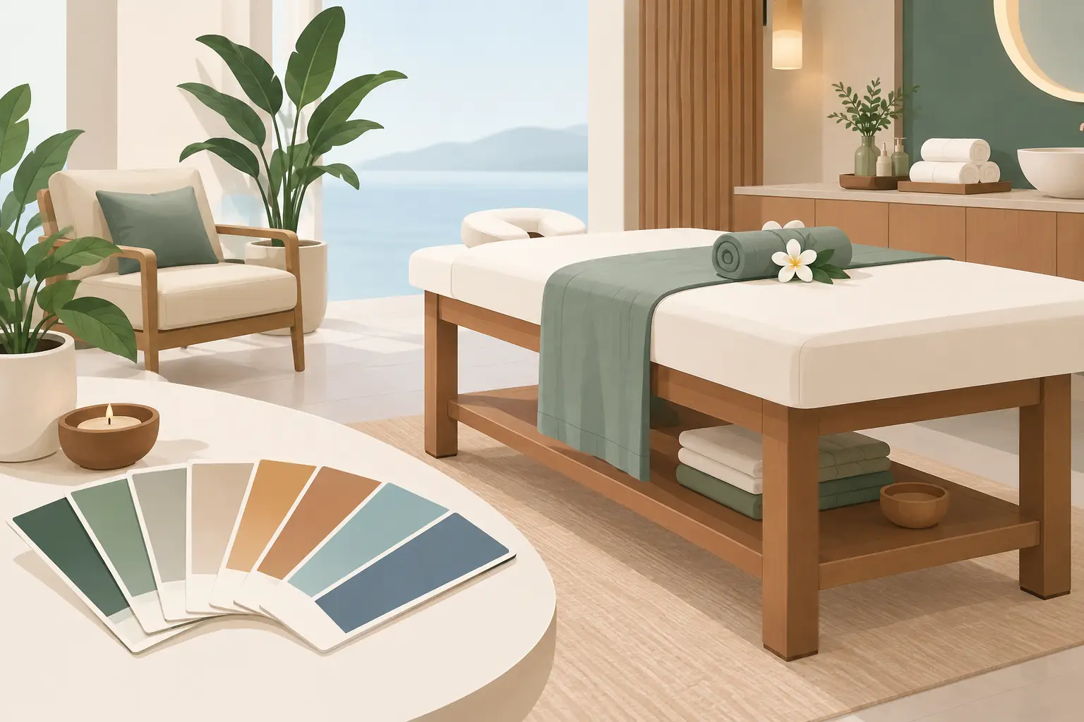
Before choosing furniture, compare physical color samples in the location where the products will live. Look at them in morning light, direct afternoon sun, shade, and under your exterior lighting. A cool gray that looks crisp in a showroom may appear blue next to warm travertine. A brown that seems neutral under indoor lights can turn orange beside a spa cabinet with gray undertones.
This small step prevents one of the most common design disappointments: furniture that is attractive on its own but disconnected from the spa area.
Build a Palette Around Fixed Outdoor Materials
A backyard spa area has more visual inputs than a living room. Deck boards, siding, retaining walls, pavers, fencing, pergola posts, and pool coping can all influence the final result. You do not need to match every surface. In fact, trying to do so can make the space look overly busy.
Choose two or three foundation colors and repeat them with purpose. The spa cabinet may be the primary color, while the deck or stone is the secondary color. Furniture can either repeat one of those shades or serve as the controlled accent that ties them together.
For example, a gray hot tub on a warm wood deck can benefit from black or dark charcoal furniture. That darker note gives the design definition without forcing a gray-on-brown compromise. If the spa sits against pale stone and light decking, furniture in a medium gray, driftwood, or muted brown can add needed visual weight.
Consider the view from inside the house, too. Many homeowners see their spa area first through a kitchen window, patio door, or family room. Color choices that look balanced at the spa should also make sense from that longer view.
Use Contrast Where Safety and Function Need It
Color coordination should never make a spa area harder to use. Steps need to be easy to see, especially at night or for guests who are less familiar with the layout. A modest contrast between the spa cabinet and entry steps can improve depth perception and make the access point more apparent.
The same principle applies to handrails, towel storage, and frequently used tables. A completely monochromatic setup can look elegant, but it may hide edges and walking paths in low light. The goal is not harsh contrast. It is a clear, comfortable transition between surfaces.
If your spa is positioned in full sun, darker colors also deserve careful consideration. They make a strong design statement, but they can feel hotter to the touch on bright summer days. Furniture-grade recycled HDPE is designed for outdoor life and is easy to maintain, yet color still affects heat absorption. In very sunny locations, a medium tone may offer a more comfortable everyday experience than the darkest available finish.
Coordinate the Big Pieces First
The largest accessory pieces carry the most visual weight. Select your spa steps, surround, and cabinet-style storage before deciding on smaller tables, planters, towel hooks, or decorative accessories. When the major pieces are coordinated, the remaining details become much easier to choose.
A full surround can make a spa feel built into the backyard, particularly when its color relates closely to the cabinet or deck. On the other hand, a contrasting surround may be the right decision when you want the spa to read as a defined destination within a larger patio. Neither approach is automatically better. It depends on whether you want the spa to blend in or become a focal point.
For swim spas, scale matters even more. A long cabinet can dominate the yard, so matching steps and storage help create continuity along its length. Repeating a single furniture color from one end to the other gives the installation a deliberate, custom appearance.
Keep Small Accessories Restrained
Once the main furniture is selected, use small accessories to add texture rather than competing colors. Neutral outdoor towels, planters, cushions, and cover lifters usually work best when they relate to the larger palette.
If you want more personality, bring it in through items that are easy to change. Deep blue towels, terracotta planters, or seasonal pillows can introduce color without committing every permanent piece to a trend. This approach preserves the long-term value of a premium spa installation while keeping the space personal.
Avoid adding multiple wood tones, several shades of gray, and bright accent colors all at once. Outdoor spaces already contain natural variation from foliage, stone, and shifting light. A quieter furniture palette lets those elements do their job.
Choose Materials That Keep Their Color Story
A well-matched color is only successful if it continues to look good after years of rain, sun, splashes, and temperature changes. Lightweight patio furniture may seem convenient at first, but fading, peeling finishes, rust, and instability can quickly disrupt the polished appearance you intended.
Furniture-grade recycled HDPE offers a more lasting solution for spa-side applications. It has the substantial feel expected in a high-end outdoor setting, resists moisture, and does not require staining or painting. It is also practical for the realities of spa ownership: wet bathing suits, chemical splashes, towels, and frequent cleaning.
Color consistency also matters when adding accessories over time. A coordinated product line and a manufacturer with experience in spa-specific furniture make it easier to expand your setup without settling for mismatched pieces. A&B Outdoor Products has worked with spa owners since 1988 and can help homeowners and dealers identify colors, dimensions, and configurations that suit a particular spa model and setting.
Bring Samples and Photos to the Decision
A few simple preparation steps can make color selection much more reliable. Photograph the spa cabinet, shell, deck, and surrounding hardscape in natural daylight. If possible, include a close-up and a wider photo that shows the entire backyard. Then compare physical color samples directly against the cabinet and deck rather than relying on a screen.
When speaking with a manufacturer or dealer, share the spa make, model, cabinet finish, and a few photos of the installation area. This is especially useful for custom steps, surrounds, and swim spa products, where dimensions and color coordination need to work together. A consultation can reveal practical concerns that a color chart cannot, such as clearance around a cover lifter, the best entry location, or whether a darker step will be comfortable in your exposure.
The most successful spa furniture colors do not call attention to themselves as a separate purchase. They make the spa easier to enter, more convenient to use, and more at home in the backyard. Choose a palette that respects the permanent materials, allows for intentional contrast, and is built to look good long after the first season.
