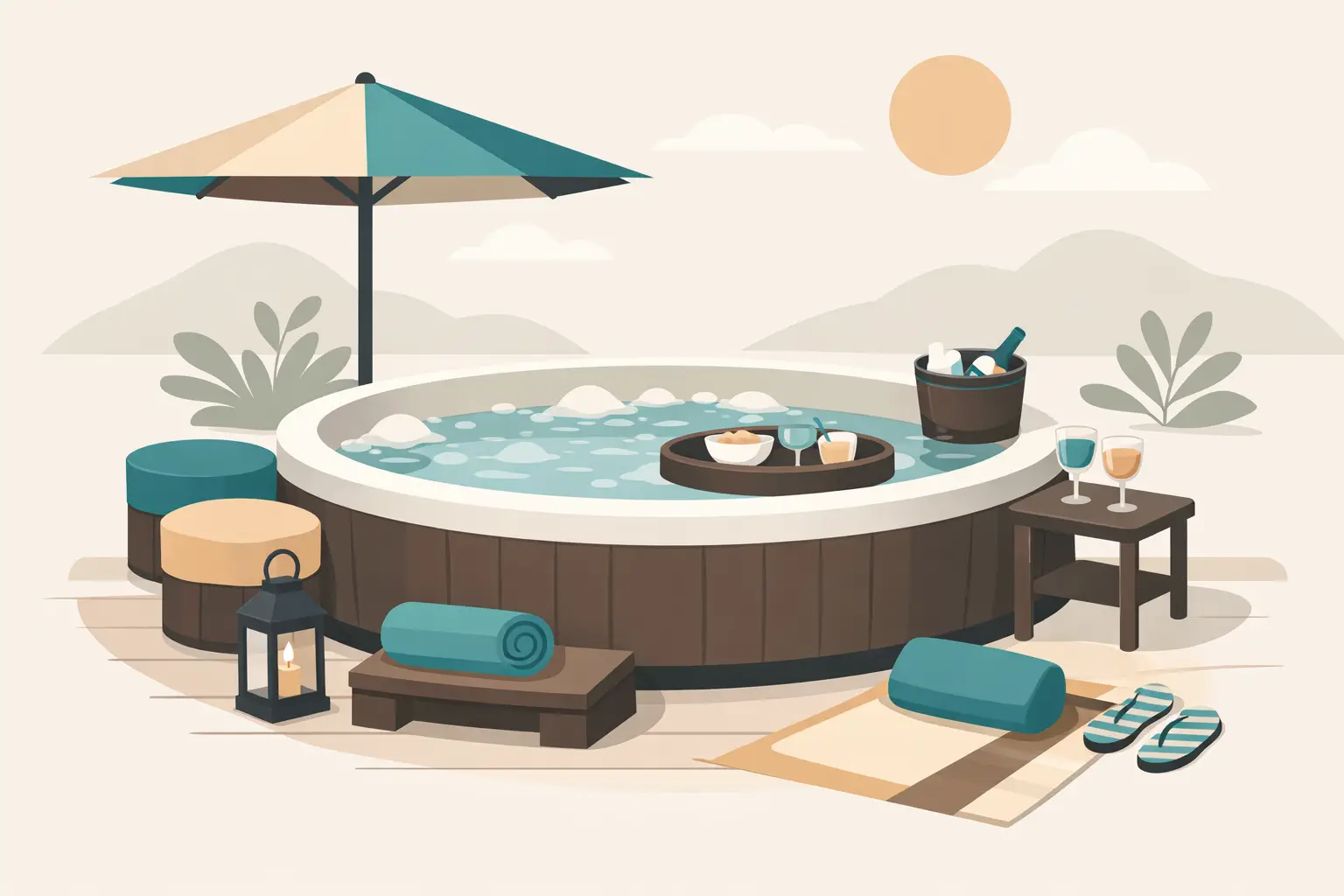
A hot tub can look expensive on its own and still feel unfinished the moment you add a step, side table, storage piece, or surround in the wrong shade. That is why hot tub color matching accessories matter more than many homeowners expect. The right accessory color does not just make the spa area look better. It helps the entire space feel intentional, higher end, and properly designed rather than pieced together over time.
For most spa owners, the goal is not perfection for its own sake. It is creating a backyard setting that feels calm, cohesive, and easy to use every day. When your steps, cabinets, handrails, and surrounding furniture work with the spa shell, cabinet, and deck colors, the result is cleaner visually and more comfortable to live with over the long term.
Why hot tub color matching accessories make such a difference
A hot tub is usually one of the largest visual elements in an outdoor living area. If you place accessories around it that are close but not quite right, the mismatch stands out fast. A gray that leans blue next to a warm taupe cabinet can make both pieces look off. A black accessory beside a rich espresso cabinet can feel harsher than expected. Even durable, well-built products can look like afterthoughts if the color relationship is not right.
Matching does not always mean everything has to be identical. In many cases, the better approach is coordination rather than exact sameness. A step can echo the cabinet tone, while a side table picks up a trim color from nearby furniture or railing. The point is visual harmony. When accessories are selected with the spa’s finish, the surrounding hardscape, and the home’s exterior in mind, the whole area looks more custom.
That matters for more than appearance. Homeowners who invest in a premium spa setup usually want products that feel worthy of the purchase. Dealers and installers know this too. If the accessory package looks integrated, customers are more likely to feel confident they made the right choice.
Start with the hot tub itself, not the accessory
The most common mistake is shopping for accessories as stand-alone items. A step may look attractive in a product photo, but if it is chosen before considering cabinet tone, shell color, coping, and nearby finishes, it can miss the mark in person.
Start by identifying the spa’s two main visual anchors: the cabinet color and the shell color. In most setups, the cabinet color will guide larger exterior accessories like steps, storage units, and surrounds. The shell color may influence accents, especially if it is visible from key sightlines or reflected in the water.
Then consider the environment around the spa. Is the tub installed against warm-toned composite decking, natural stone, brushed concrete, or pavers with mixed undertones? Is the home’s exterior trim crisp white, charcoal, bronze, or cedar? Good color matching happens at the space level, not just at the product level.
This is where premium accessory planning separates itself from impulse buying. A cohesive result often comes from seeing the spa area as an outdoor room, not just a tub with add-ons.
Which accessories should match most closely
Some pieces need tighter color coordination than others. Steps are usually the most important because they sit directly against the spa and are used every day. If the step color clashes, it is immediately noticeable. Surround systems and cabinetry are also high-visibility items and should be chosen with close attention to cabinet compatibility and scale.
Side tables, towel storage, and planter-style pieces have slightly more flexibility. These can either blend into the spa cabinet color or act as supporting tones that connect the spa to the rest of the backyard. Handrails are a special case. Safety comes first, but finish still matters. A handrail that complements nearby hardware, fencing, or outdoor furnishings will feel more intentional than one selected solely because it was available.
If you are building out a larger swim spa or hot tub area, consistency across multiple accessories becomes even more important. A coordinated collection gives the space a furniture-grade appearance. Mixed materials and unrelated colors can make a premium installation look busy.
How to choose the right color family
Neutral tones remain the safest and most versatile choice for hot tub environments because they age well visually and work with a wide range of outdoor materials. But neutral does not mean simple. Gray, brown, black, beige, and driftwood-inspired finishes all carry undertones that affect the final look.
Warm grays pair well with tan stone, cedar fencing, and bronze hardware. Cooler grays often suit modern patios, stainless details, and contemporary spa cabinets. Brown and espresso tones tend to create a richer, more traditional outdoor look, especially when paired with wood-look decking or earth-toned pavers. Black can be striking and sophisticated, though it works best when repeated elsewhere in the space so it does not feel isolated.
If your spa cabinet has a blended or textured finish, avoid assuming any single solid color will match automatically. Multi-tone surfaces are often better served by accessories that pull from the dominant undertone rather than trying to mimic every variation. Close coordination usually looks more refined than a near miss.
Hot tub color matching accessories and material quality go together
Color alone will not create a premium result if the accessory material looks cheap or fades unevenly. This is one reason serious spa buyers pay attention to construction as much as finish. Outdoor accessories need to hold their color and structure through sun, rain, temperature swings, and regular use.
Furniture-grade recycled HDPE has become a strong choice for homeowners who want lasting color stability, low maintenance, and a substantial look. It delivers a cleaner, more finished appearance than many lightweight or painted alternatives, especially around high-end spas and swim spas. It also gives manufacturers more control over consistent color offerings across product lines.
That consistency matters when you are coordinating multiple pieces. If a step, storage cabinet, and side table are all meant to work together, the material and finish quality have to support that promise. Otherwise, even well-intended matching can fall apart after a season or two outdoors.
When exact matching is worth it and when it is not
There are cases where exact color matching is absolutely the right move. If the spa is installed in a prominent entertaining space, if the accessory sits flush to the cabinet, or if the homeowner wants a tailored built-in appearance, close matching has clear value. It creates a cleaner line and reduces visual clutter.
But there are also times when contrast works better. A dark spa may benefit from slightly lighter steps if the surrounding patio is also dark and the area needs visual lift. A lighter cabinet may pair well with a deeper accent table if the goal is to tie in black window frames, railings, or outdoor kitchen finishes. Safety and readability matter too. In some settings, a subtle contrast can make step edges easier to distinguish.
This is where experience helps. Good accessory selection is rarely about following one rigid rule. It is about balancing the spa finish, the site conditions, and how the customer wants the space to feel.
Why custom guidance matters
Photos on a screen can flatten color and distort undertones. Sunlight changes everything. So does shade, surrounding stone, and even nearby landscaping. That is why homeowners and dealers often get better results when they work through color coordination with a manufacturer or specialist who understands spa installations in practical detail.
A consultative approach saves time and prevents expensive second-guessing. Instead of guessing whether a gray is warm enough or whether a brown finish will feel too red against the cabinet, buyers can compare options with the full setting in mind. For premium products, that support is not a luxury. It is part of getting the result right.
A&B Outdoor Products has built its reputation around that kind of practical guidance, helping customers match accessory solutions to both spa models and backyard design goals. That kind of support becomes especially valuable when the project includes multiple pieces, custom sizing, or a higher-end outdoor layout.
The best-looking spa spaces are also the most usable
The strongest accessory plans do not choose between form and function. They solve both. A matched step should provide confident entry and exit. A coordinated storage piece should keep chemicals, towels, or covers organized without looking utilitarian. A surround should improve access and appearance at the same time.
That balance is what gives a backyard spa area a finished feel. Not showroom perfect, but well considered, durable, and comfortable to use year after year. When color coordination is handled well, the accessories stop drawing attention to themselves and start supporting the entire experience.
If your spa area feels close but not quite complete, the answer may not be a bigger renovation. It may be choosing accessories that finally look like they belong there.
